
September 27, 2026
The first piece of work: introducing Különös Klub
In spring 2025 I signed up for an introductory front-end course at Prooktatás; the project I built there is Különös Klub, the website of a fictional Lovecraftian horror role-playing club.
Back then AI wasn’t yet the dominant force it is now — or at least, the models weren’t at the level they’re at today. Honestly, it’s a fairly brutal amount of progress for something that has happened in under two years.
The idea
I spent a long time thinking about the theme, and then, in the middle of my characteristic total lack of ideas, The Idea flashed up: I wouldn’t build the umpteenth tattoo studio or random services website, I’d go with my hobbies instead. It isn’t for a client anyway, there’s not much at stake either, so I can just be myself. We were playing a lot of RPGs back then, and I’m a great admirer of Lovecraftian horror. The idea of what kind of mood I wanted to “get onto canvas” came together quickly.
A dear friend of mine helped enormously — the billowing vanta.js fog was his idea, and so were the fonts that carry the mood. The layout, too, actually: that the menu goes centred under the title, the classic way, rather than in the header layout that dominates these days (a hamburger on mobile). I’ll come back to that in a few words further down. He generated the images for the adventures as well; I only did the GMs and the Filter Club in the character break section. So my main achievement is that I pick my friends well :)
The GMs and the adventures
These sections were inspired partly by personal experience, partly by LLM brainstorming. This was the funniest part, because the characters ended up accidentally stereotypical:
- Kíra, the attractive one, who turns up in the nerd club and “brings freshness and dynamism into the life of the team”.
- Then there’s the obligatory funny character, Brazil, who I created in the image of a well-liked colleague of mine.
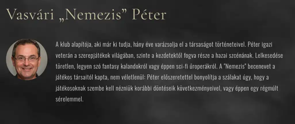
- And finally “Nemesis”, the boss: that picture, oh my — that seductive smirk is genius.
 (full-size image)
Stumbles
There were beginner mistakes too, of course.
I had no routine in modular programming, so everything went into one huge global.css, and past a certain size it understandably got on top of me. I’m deliberately not fixing it after the fact — this one’s a borderline case, I thought about it a lot. But I concluded: if it works, don’t touch it.
My dear friend mentioned static site generators — but I didn’t know exactly what that meant, I sort of misunderstood it, and somehow I experienced it as cheating. As if I’d had a piece of software make something that, in an exam project, is essentially my job. So I think there isn’t even a baseof.html (maybe there is), everything was made completely manually. Pointless, obviously, but I didn’t know that yet after a 3-month front-end course. Sometimes I’m too “clever”.
Overall — especially if you don’t look under the bonnet — I’m proud of the site. It turned out a polished first piece of work, and it was genuinely a joy to work on it. I got an excellent assessment from Prooktatás; unfortunately it wasn’t picked for the student projects they showcase on their site, but as they say: never mind :)
- Build time: around 2 weeks
- LLM use: more as a supplement, not dominant. For images, for some of the JavaScript code, for giving me a starting point with texts, and not a little bit for CSS debugging.
- Tools: vanilla CSS/HTML/JS, GitHub, statichost.eu, various models
-
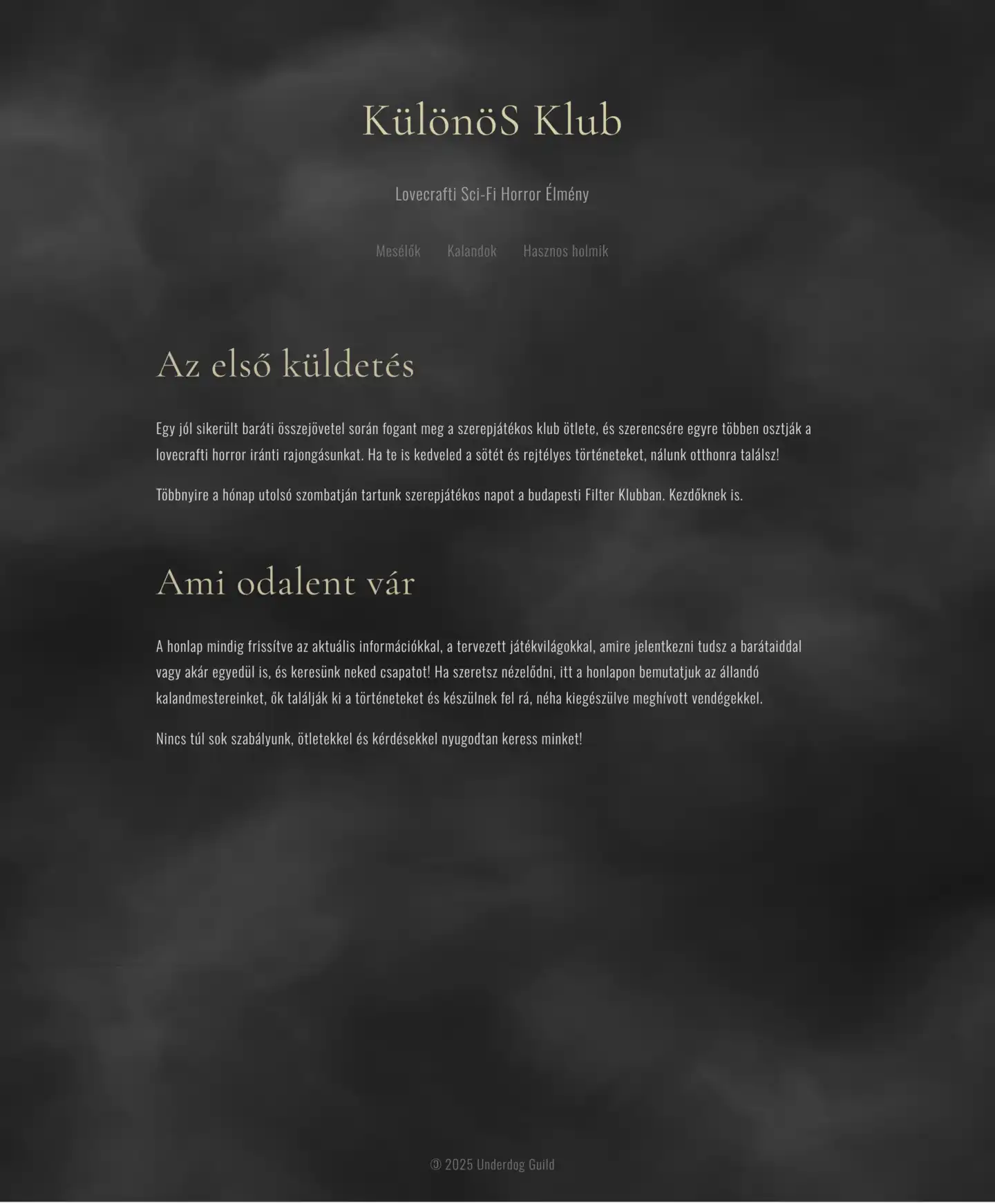 (full-size image)
Home -
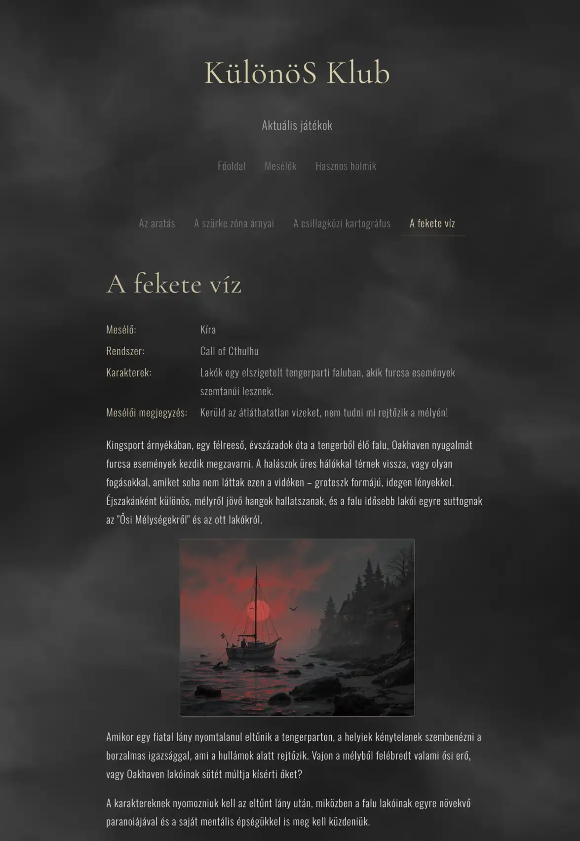 (full-size image)
Adventure -
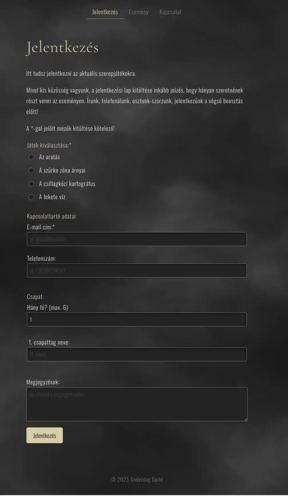 (full-size image)
Form -
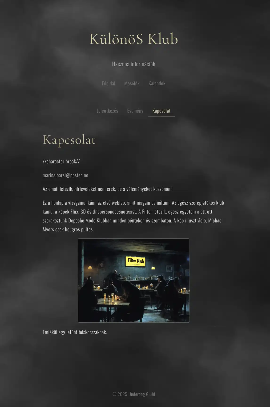 (full-size image)
Contact
Why no hamburger menu?
And now the menu. I hadn’t planned a separate section for it, but it ended up longer than the project itself :)
Both the exam project and Underdog Guild are hobby sites. I don’t get thousands of visitors — honestly, not even 100 :) — I have no A/B tests, and not too many clients I have to explain my decisions to. That’s the freedom of the Underdog Guild: I can get away with not using the usual cookie-cutter template.
When I started putting my exam project together, once I got to the structure I tried to pick a style — what kind of hamburger menu to have on mobile, like I see everywhere, just a bit more original. But a friend of mine vetoed it straight away: preferably none at all :)
So I stuck with the old-fashioned, centred, always-visible menu: the title at the top, and the links centred below it in their own bar. No hamburger on mobile either, it just wraps onto two lines.
1. What you hide, nobody uses
The strongest argument isn’t taste, it’s measurement, so I looked it up. Nielsen Norman Group tested hidden vs visible navigation with 179 people on 6 real sites:
- In desktop view, people used the hidden menu in 27% of cases, the visible one in 48%, and the partially visible one in 50%. So almost half as many.
- On mobile it’s 57% vs 86%, in favour of the combined, partially visible menu.
- With hidden navigation, discoverability of the content people were looking for dropped by more than 20%, they rated the task 21% harder than with a visible menu (11% harder than with a partly visible one), and they were 39% slower in desktop view and 15% slower on mobile.
The explanation is simple and familiar to everyone: out of sight, out of mind.
The list behind a hamburger is an extra click, extra thinking. The ☰ icon on its own tells you nothing — you can’t tell from it whether what you’re looking for is in there.
Whereas something like Home | Projects | About | Blog | Contact can be scanned in a single glance. That’s what they call information scent: you don’t have to guess, you have to recognise.
On top of that, a tiny hamburger visually disappears on a big monitor.
On one of the sites they tested, Slate, only 17% of people used the navigation at all, against the 42% desktop average, and it took 33 seconds on average to find it, against a desktop average of 25 seconds. You’d think I wouldn’t need to write this down, but I keep seeing it on more and more sites in desktop view too, just so there’s more room for a decorative image, for instance. (Yes, HBO, I mean you! :))
And yes, I know: by 2025 almost everyone recognises the hamburger icon. According to NN/g’s recent article it’s no longer a mysterious symbol these days.
But it’s still an interaction cost: I recognise it, but I still have to click it just to see whether there’s a menu item in there for me. If there’s no shortage of space, why would I ask for that?
I’m not short of space. I have a handful of menu items. The sites that really have to hide them — the BBC, Amazon, big news portals — work with 20+ sections. I don’t. Mine fits in one row, on mobile in two.
There’s a small psychological detail here too: a menu that’s always in the same place and always visible doesn’t get read on a second visit, people just reach for it. Spatial memory.
To be fair: not everything “centred” is good. The same research firm measured that with a centred logo, users are six times more likely not to get back to the home page in one click, because they reflexively look top left.
The 5–6 links simply wrap, centred, with big 44px touch targets. Not the most modern solution from a designer’s point of view, but on a bus, in sunlight, with your thumb it’s much easier to hit than an icon crammed into the top right corner.
If you’re struggling with a lot of menu items, a good compromise is to mix the two: a few important links visible, the rest under a big, labelled Menu ▼ button.
I’m not claiming the hamburger is evil. On a big site, when space is short, it’s a necessary evil — but on an average few-page website there’s no point hiding those few words. That’s why I keep the centred, always-visible menu, and if I can, I don’t have a hamburger. And on my own site there’s a one-page anchor nav, on mobile too.
Unfortunately my last client project is proof that I can’t always get away with it: a dental practice site needed 6 menu items + info + a CTA in a sticky header, and there the hamburger was the compromise on mobile.
There are no rules set in stone, you always have to adapt.
Sources
The navigation arguments largely go back to one research group, Nielsen Norman Group. They measured this in 2015–16 (a test with 179 participants), and in 2025 they revisited how recognisable the hamburger icon is today. That’s why I cite them this much.
- Pernice, Budiu — Hamburger Menus and Hidden Navigation Hurt UX Metrics
- Beyond the Hamburger on Desktops / on Mobile
- Mobile First is NOT Mobile Only
- Kaplan 2025 — Hamburger icon recognizability
- Menu-Design Checklist 2024
- Centered Logos Hurt Navigation
- Flat UI Less Attention / Long-Term Exposure to Flat / Low-Contrast
- Erik Runyon / Notre Dame carousel
- Baymard: 10 UX Requirements for Homepage Carousels